Chapter 1. Indicator overview: OECD snapshots and country dashboards1
This chapter presents a set of selected indicators on health and health system performance, designed to shed light on how well OECD countries perform along five dimensions: health status, risk factors for health, access to care, quality and outcomes of care, and health care resources. These indicators, taken from the main chapters of the publication, are presented in the form of OECD snapshots and country dashboards. The former illustrates time trends for the OECD as a whole, together with a snapshot of the latest available data (OECD average, top and bottom performers). The dashboards summarise how each country performs on all indicators compared to the OECD average.
The selection of the indicators presented in this chapter was based on policy relevance, data availability and ease of interpretation. The selection and comparison of indicators is meant to capture relative strengths and weaknesses of countries to help identify possible areas for priority action, though not to identify which countries have the best health system overall.
OECD snapshots and country dashboards
Policy makers in OECD countries have a keen interest to understand how well their health systems perform. A look at indicators contained in this publication shows that significant progress has already been achieved. People in OECD countries are living longer than ever before, with life expectancy at birth now exceeding 80 years on average, thanks to improvements in living conditions and educational attainments, but also to healthier lifestyles and progress in health care.
In most countries, universal health coverage provides financial protection against the cost of illness and promotes access to care for the whole population. Quality of care has also generally improved, as shown by the reduction in deaths after heart attacks and strokes, and the earlier detection and improved treatments for diseases such as diabetes and cancer. But these improvements have come at a cost: health spending now accounts for about 9% of GDP on average in OECD countries, and exceeds 10% in many countries. Higher health spending is not necessarily a problem when the benefits exceed the costs, but there is ample evidence of inequities and inefficiencies in health. There is also a need to achieve a better balance between spending on curative care and disease prevention.
Despite these improvements, important questions remain about how successful countries are in achieving good results on different dimensions of health system performance. For example, what are the main factors explaining differences in health status and life expectancy across OECD countries? Is the increase in the prevalence of certain risk factors, such as obesity, offsetting some of the gains from the reduction in other risk factors like smoking? To what extent can citizens benefit from adequate and timely access to care, and good financial protection against the costs of health care? What do we know about the quality and safety of care provided to people for a range of common health conditions? What are the financial, human and technical resources allocated to health systems in different countries?
Answering these questions is by no means an easy task, but the snapshots and dashboards presented in this chapter can help shed light on how well countries do in promoting the health of their population and on several dimensions of health system performance. They do not have the ambition of identifying which countries have the overall best health system; rather, they summarise some of the relative strengths and weaknesses of OECD countries on a selected set of indicators of health and health system performance. They can be useful to identify areas for priority action, but should be complemented by a more in-depth review of the data and factors influencing cross-country variations, presented in the main chapters of this publication.
This chapter presents five sets of indicators, which are discussed in full in the chapters in parentheses, highlighting how well countries fare in each of the following dimensions:
-
Health status (Chapters 3 and 11)
-
Risk factors for health (Chapter 4)
-
Access to care (Chapter 5)
-
Quality of care (Chapter 6)
-
Health care resources (Chapters 7, Chapter 8 and 9)
For each of these dimensions, a set of 4-5 relevant indicators is presented in the form of OECD snapshots and country dashboards. These indicators are selected from the publication based on their policy relevance and importance as key factors to monitor in a health system, but also on data availability and interpretability. Therefore, indicators for which country coverage is highest are prioritised to improve comparability.
OECD snapshots, newly introduced, provide summary statistics for key indicators in the five dimensions listed above. They complement the country dashboards by visualising:
-
the latest OECD average (for quick comparison with country figures in the dashboards)
-
the distribution of top and bottom values (for a general sense of the dispersion surrounding each indicator)
-
the overall OECD trend since 2005 (to highlight changes over time)
The snapshots complement the country dashboards, helping the reader make a first assessment of a country’s performance vis-à-vis the OECD average and value range before delving into the more detailed indicator chapters of the publication.
Country dashboards, in the form of summary tables, compare a country’s performance to one another and the OECD average. Countries are classified for each indicator into three colour-coded groups:
-
Blue, when the country’s performance is within close distance of the OECD average
-
Green, when the country’s performance is considerably better than the OECD average
-
Red, when the country’s performance is considerably worse than the OECD average
The only exception to this grouping is for the dashboard on health care resources (Table 1.5), where the indicators presented cannot be strictly classified as better or worse performance. For this reason, the colour coding in this dashboard uses a lighter and darker shade of blue to signal that a country is considerably below or above the OECD average. Values for each indicator are shown for all countries and for the OECD as a whole.
OECD snapshots
For each indicator, the OECD average, highest and lowest values for the latest available year are shown, corresponding to the data presented in the main chapters of the publication. The spark lines on the right show OECD-wide trends in recent years. These are calculated based on an unweighted mean of the data available for each year (data linearly interpolated when unavailable, for consistency regarding the number of countries used for the means). These spark lines are intended to give a broad overview of trends, given potential differences in methodology or country composition over time.
Country dashboards
The classification of countries as better, worse or within close distance of the OECD average is based on each indicator’s standard deviation. This method is preferred to using a fixed percentage or fixed number of countries per category, since it reflects variation (how far a country is from the OECD average) in a dynamic way.
The standard deviation is a common statistical indicator of variation in a distribution, measuring how close values are to the central tendency. Countries are classified as “close to the OECD average” (blue) whenever the value for any indicator is within one standard deviation from the OECD mean for the latest year. In rare cases, particularly large outliers are excluded from the calculation of the standard deviation. These exceptions are noted under the relevant dashboards.
For a typical indicator, about 65% of the countries (23 countries) will be close to the OECD average, with the remaining 35% performing significantly better (green) or worse (red). When the number of countries that are close to the OECD average is higher (lower) than 23, it means that cross-country variation is relatively low (high) for that indicator. For example, indicators such as male life expectancy and alcohol consumption show that 28 countries are close to the OECD average, meaning that countries show relatively less variation compared to other indicators.
Health status
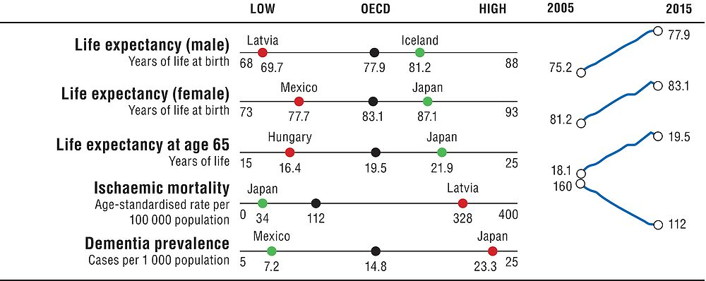
Life expectancy is a key indicator to understanding the overall health of a population. It therefore is the focus of this section, with three indicators reflecting gender and age-specific life expectancies. More specific indicators on ischaemic heart mortality and dementia prevalence are also shown, two major causes of mortality and morbidity today and in the future. Figure 1.1 provides a snapshot on health status across the OECD and Table 1.1 provides more detailed country comparisons.
Note: the Y-axis for OECD trends is standardised to have fixed height, based on the minimum and maximum values of the indicator. The high-low X-axis is standardised with constant distance from the OECD average whenever the indicator is not truncated at 0.
|
Table 1.1. Dashboard on health status
|
|---|
|
|
|
Note: All data refer to 2015 or nearest year, except for dementia prevalence, which refers to 2017. Indicators are taken from Chapter 3 (life expectancy, male and female; ischaemic mortality) and Chapter 11 (life expectancy at 65; dementia prevalence). |
|
Source: OECD Health Statistics 2017; OECD analysis of data from the World Alzheimer Report 2015 and the United Nations (for prevalence of dementia). |
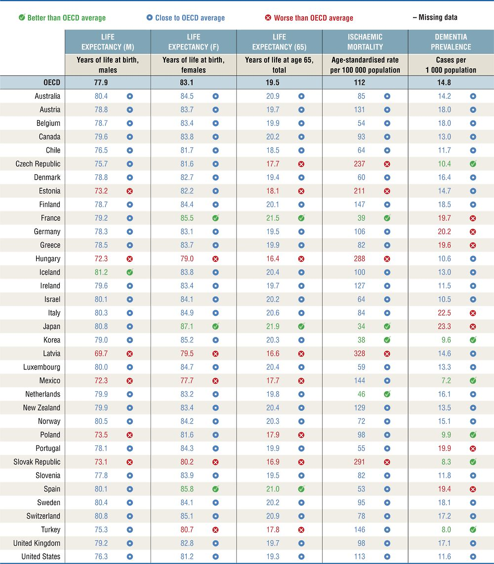
In general, Japan, France and Spain have the best overall health outcomes in terms of life expectancy and ischaemic heart mortality. Hungary, Latvia, Mexico and the Slovak Republic are consistently below the OECD average for these indicators. Across the OECD, life expectancy has increased steadily over time, though about half of the countries reported slight falls in life expectancy between 2014 and 2015. At the same time, some of the countries with the highest rates of dementia prevalence are the countries with longer life expectancies, such as Japan and Italy. Dementia prevalence also shows the greatest amount of variation across countries, amongst these indicators.
Important variations in life expectancy by gender and age exist. Women in Japan, Spain and France live much longer than the OECD average; while male life expectancy is particularly high in Iceland. Life expectancy at 65 is noticeably lower than the OECD average in 12 countries, and noticeably higher than the average in Japan, France and Spain. Life expectancy is affected by a range of factors within and beyond the health system. Higher health spending per capita is positively associated with life expectancy, though this relationship is less pronounced in countries with the highest health spending, such as Luxembourg, Norway, Switzerland and the United States. Differences in risky behaviours such as smoking and obesity, which have a major impact on health, can also partly explain cross-country variation and differences in life expectancies. Factors beyond the health system are also important determinants of health, including income, education and other socio-economic factors.
Ischaemic heart disease remains the highest cause of mortality in most OECD countries, though there has been an average decline of more than 50% since 1990. Mortality rates are considerably above the OECD average in five countries, and are highest in Latvia, the Slovak Republic and Hungary; whereas they are relatively low in Japan, Korea, France and the Netherlands.
The prevalence of dementia, a variety of brain disorders of which Alzheimer’s disease is the most common form, is a core indicator to monitor the health of ageing populations. Dementia prevalence is noticeably higher than the OECD average in seven countries and highest in Japan, Italy and Germany. Countries with younger populations typically have lower dementia prevalence, with Mexico, Turkey and the Slovak Republic having the lowest rates of dementia.
Risk factors for health
Smoking, alcohol consumption and obesity are three major risk factors for non-communicable diseases. Population exposure to air pollution is also a critical non-medical determinant of health. Figure 1.2 provides a snapshot on risk factors for health across the OECD and Table 1.2 provides more detailed country comparisons.
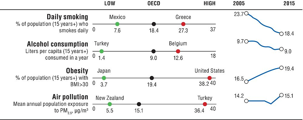
Note: The Y-axis for OECD trends is standardised to have fixed height, based on the minimum and maximum values of the indicator. The high-low X-axis is standardised with constant distance from the OECD average whenever the indicator is not truncated at 0. Air pollution shows data for 2005 and 2010 to 2015.
|
Table 1.2. Dashboard on risk factors for health
|
|---|
|
|
|
Note: All data refer to 2015 or nearest year. Indicators are taken from Chapter 4. Obesity data reports a mix of measured and self-reported weights, with measured data often being higher and more accurate compared to self-reported weight. Chapter 4 details the country coverage for each measure. |
|
Source: OECD Health Statistics 2017; World Development Indicators (for air pollution). |
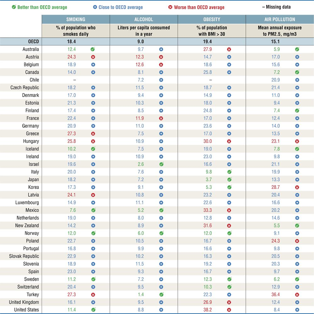
In general, Iceland, Norway and Sweden perform well across these indicators. Smoking rates are considerably below the OECD average in Mexico, Iceland, Sweden, the United States, Norway and Australia; whereas they are much higher in Greece, Turkey, Hungary, Austria and Latvia. Although most countries have managed to reduce smoking rates in recent decades, there is still significant progress to be made. Tobacco smoking has been estimated by the World Health Organization to kill 7 million people each year, yet, on average 18.5% of adults still report daily smoking across the OECD.
Excessive alcohol consumption is also a considerable health burden, associated to increased risk for a range of illnesses, including cancer, stroke, liver disease, as well as social problems, with an estimated 2.3 million deaths per year. Populations in Belgium, Austria and France consume considerably more litres per capita than the OECD average, while it is relatively low in Turkey, Israel, Mexico and Norway. Alcohol consumption has been fluctuating over the past 15 years, with a slight reduction across the OECD as a whole in average litres consumed (based on sales figures). Binge drinking is of particular concern in certain countries, notably Germany, Finland, Luxembourg and Denmark, and is more predominant among men.
Obesity is a major risk factor for many chronic diseases, including diabetes, cardiovascular diseases and cancer. Obesity rates have been increasing in recent decades in almost all OECD countries, with an average of 54% people overweight, of which 19% are obese. Obesity rates are considerably higher than the OECD average in five countries, with rates highest in the United States and Mexico. Obesity is lowest in Japan, Korea, Italy and Switzerland. The measure reported here is for obese adults based on both measured and self-reported data. Caution should be taken in comparing countries with reporting differences, since measured data is generally much higher (and more accurate).
Air pollution is a major environmental threat, with health links to lung cancer, respiratory and cardiovascular disease, low birth weight, dementia and other health problems. Population exposure to fine particulates (PM2.5) is particularly high in Turkey, Korea, Poland and Hungary. It is considerably below the OECD average in Australia, New Zealand, Sweden, Canada, Finland and Iceland. While the overall trend since 1990 has been downward, there have been some increases in population exposure to PM2.5 in more recent years.
Access to care
Access to care is a critical measure of health system performance. Indicators presented here include population coverage, an overall measure of health care coverage, alongside indicators reflecting financial and timely access. The access to care chapter also includes geographic accessibility measures, not included here because of the complexity of cross-country comparisons. Figure 1.3 provides a snapshot on access to care across the OECD and Table 1.3 provides more detailed country comparisons.
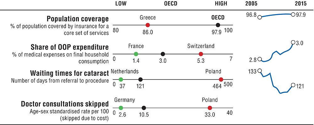
Note: the Y-axis for OECD trends is standardised to have fixed height, based on the minimum and maximum values of the indicator. The high-low X-axis is standardised with constant distance from the OECD average whenever the indicator is not truncated at 0.
|
Table 1.3. Dashboard on access to care
|
|---|
|
|
|
* Poland is excluded from the standard deviation calculation. ** Estonia and Poland are excluded from the standard deviation calculation. The values for Australia and Canada are reported in median number of days, rather than mean. |
|
Data on population coverage, share of OOP and waiting times refers to 2015, consultations skipped due to cost refer to 2016. Indicators are taken from Chapter 5. |
|
Source: OECD Health Statistics 2017; Commonwealth Fund International Health Policy Survey 2016 and other national sources. |
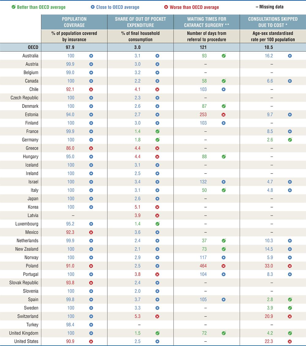
In terms of population coverage, most OECD countries have achieved universal (or near-universal) coverage of health care costs for a core set of services, except for six countries which remain considerably below the OECD average – Chile, Greece, Mexico, Poland, the Slovak Republic and the United States.
Population coverage, though, is not sufficient by itself. The degree of cost-sharing applied to those services also affects access to care. Out-of-pocket (OOP) expenditures and consultations skipped due to cost are two indicators measuring financial access, which is of particular concern for low-income population groups. OOP expenditures can create financial barriers to health care. Across the OECD, they have made up a slightly increasing share of household consumption over time, and are relatively high in Korea, Switzerland, Greece, Hungary, Mexico, Portugal and Chile. The rate of consultations skipped due to cost is particularly high in Poland, the United States and Switzerland (for the subset of 17 countries with comparable data).
Long waiting times are also an important barrier to access in many OECD countries. They are the result of a complex interaction between supply and demand of health services, with doctors playing a crucial role on both sides. Long waiting times for elective (non-emergency) surgery lead to patients suffering unnecessary pain and disability. Waiting times for cataract surgery, one of the most commonly reported indicators, are particularly high in Poland and Estonia (for the subset of 16 countries with comparable data), while numbers are very low for Canada, Italy and the Netherlands.
Quality and outcomes of care
Measures of the quality and outcomes of care should reflect appropriateness of care, clinical effectiveness, patient safety and the person responsiveness of care. The appropriateness of care is measured by antibiotics prescribed and asthma/COPD admissions as an indicator of avoidable admissions. 30-day mortality following acute myocardial infarction (AMI) and colon cancer survival are indicators of clinical effectiveness; obstetric trauma is a measure of patient safety. Figure 1.4 provides a snapshot on quality and outcome of care across the OECD and Table 1.4 provides more detailed country comparisons.
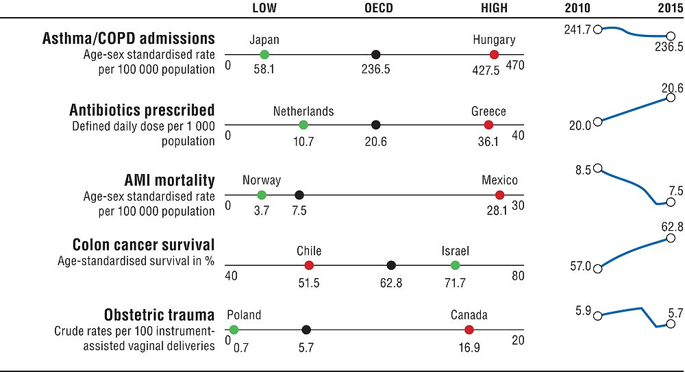
Note: the Y-axis for OECD trends is standardised to have fixed height, based on the minimum and maximum values of the indicator. The high-low X-axis is standardised with constant distance from the OECD average whenever the indicator is not truncated at 0. Asthma/COPD admissions and antibiotics prescribed report 2011 as the baseline year. Obstetric trauma reports 2010.
|
Table 1.4. Dashboard on quality of care
|
|---|
|
|
|
Note: All data refer to 2015 or nearest year. Indicators are taken from Chapter 6. |
|
* Mexico is excluded from the calculation of the standard deviation. ** Canada is excluded from the calculation of the standard deviation. |
|
Source: OECD Health Statistics 2017. |
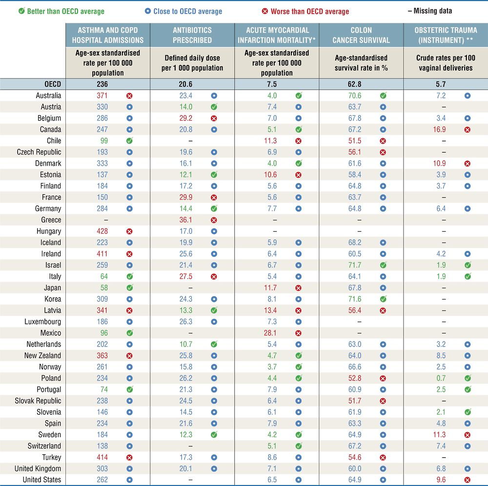
Asthma and COPD admissions are conditions for which effective treatment at the primary care level is well established, but they vary significantly across countries. They are considerably higher than the OECD average in Hungary, Turkey, Ireland, Australia, New Zealand and Latvia; but much lower than the OECD average in Japan, Italy, Portugal, Mexico and Chile. The number of antibiotics prescribed is higher than the OECD average in Greece, France, Belgium and Italy. Antibiotic prescriptions are considerably below the OECD average in the Netherlands, Estonia, Sweden, Latvia and Austria. The number of antibiotics prescribed has increased slightly over time, with overuse of antibiotics not only a wasteful use of resources, but also responsible for increased antimicrobial resistance.
Mortality following acute myocardial infarction (admission-based) is a long-established indicator of the quality of acute care. It has been steadily declining since the 1970s in most countries, yet important cross-country differences still exist. Mexico shows very high mortality following AMI; rates are also relatively high in Latvia, Japan, Chile and Estonia. Eight countries have mortality rates considerably below the OECD average, with Norway, Australia and Denmark having the lowest rates.
Colon cancer survival rates vary relatively less than AMI, with only Israel and Korea performing better than the average, and five countries performing considerably worse, with Chile and Slovenia having the lowest rates.
Obstetric trauma (with instrument) is the most robust measure available for the dimension of patient safety. For the subset of 21 countries with comparable data, obstetric trauma is highest in Canada, followed by Sweden, Denmark and the United States. In contrast, rates of obstetric trauma are considerably lower than the OECD average in Poland, Israel, Italy, Slovenia and Portugal.
Health care resources
Having sufficient health care resources is critical to the functioning of health systems. But higher resources do not automatically translate into better health outcomes – the effectiveness of spending is also important. Health care expenditure per capita is the most immediate summary measure of health care resources. The supply of health workers (doctors and nurses) and hospital beds are also reported, since higher health spending is not always closely related to these indicators. Figure 1.5 provides a snapshot on health care resources across the OECD and Table 1.5 provides more detailed country comparisons.
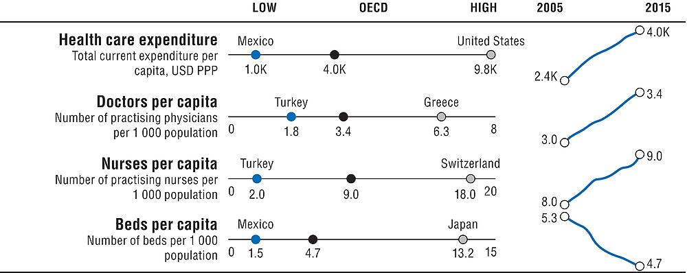
Note: the Y-axis for OECD trends is standardised to have fixed height, based on the minimum and maximum values of the indicator. The high-low X-axis is standardised with constant distance from the OECD average whenever the indicator is not truncated at 0.
|
Table 1.5. Dashboard on health care resources
|
|---|
|
|
|
Note: All data refer to 2015 or nearest year, except for health care expenditure, which refers to 2016. Indicators are taken from Chapter 7 (health expenditure), Chapter 8 (doctors and nurses per capita) and Chapter 9 (beds per capita). |
|
* United States is excluded from the standard deviation calculation. ** Japan and Korea are excluded from the standard deviation calculation. For Ireland, private hospitals beds are excluded. |
|
Source: OECD Health Statistics 2017. |
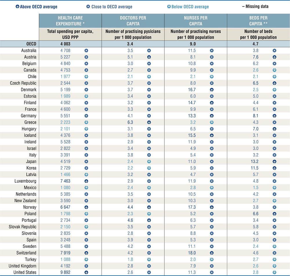
In general, countries with higher health spending and higher numbers of health workers and other resources have better health outcomes, quality and access to care. However, the absolute number of resources invested is not a perfect predictor of better outcomes – efficient use of health resources is also critical.
In terms of overall health care expenditure, the United States spends considerably more per person than any other country. Health care spending is also high in Switzerland, Luxembourg and Norway. Nine countries spend less than the OECD average, with health spending per capita lowest in Mexico, Turkey and Latvia. Health spending has been consistently growing in all countries over the past decades, other than a slowdown following the financial crisis. Looking at growth rates of spending as a share of GDP, in addition to absolute levels of spending, can give a better perspective on how much countries spend relative to the general economy.
A large part of health spending is translated into wages for the workforce. The number of doctors and nurses in a health system is therefore an important way of monitoring how resources are being used. The number of doctors per capita is relatively high in Greece, Austria, Portugal and Norway. Among these countries, Greece has one of the lowest numbers of nurses per capita, suggesting the potential to decrease the doctors to nurses ratio. This could generate significant cost savings in the long run. In contrast, Norway has one of the highest numbers of nurses (Austria and Portugal nurses per capita are close to the OECD average). Nurses per capita are particularly high in Switzerland, Germany and Nordic countries. While the total number of nurses has grown more than doctors in absolute terms, both have grown at similar rates in recent years, at around 13%.
Hospitals also take an important share of health care resources, with hospital beds per capita a marker of the physical and technical resources available in a health system. Reductions in the number of beds in many OECD countries over the past years have been a voluntary effort to encourage a shift to day surgery and primary care. Nevertheless, the number of beds per capita remains particularly high in Japan and Korea.
Note
← 1. The statistical data for Israel are supplied by and under the responsibility of the relevant Israeli authorities. The use of such data by the OECD is without prejudice to the status of the Golan Heights, East Jerusalem and Israeli settlements in the West Bank under the terms of international law.