Chapter 2. Trends in the distribution of income and wealth
This chapter provides a brief overview of trends in the distribution of income and wealth in OECD countries. The chapter starts by looking at income inequality trends before examining trends in the distribution of wealth and patterns in the composition of assets across the wealth distribution.
The statistical data for Israel are supplied by and under the responsibility of the relevant Israeli authorities. The use of such data by the OECD is without prejudice to the status of the Golan Heights, East Jerusalem and Israeli settlements in the West Bank under the terms of international law.
This chapter provides a brief overview of trends in the distribution of income and wealth in the OECD. Patterns of asset holdings are critical to assessing the potential distributional effects of net wealth taxes. Trends in the distribution of income and wealth are also helpful to understand the renewed interest in net wealth taxes in recent years. This chapter starts by looking at income inequality trends in all OECD countries before examining trends in the distribution of wealth and patterns in the composition of assets across the wealth distribution.
Income inequality has increased in the last 30 years
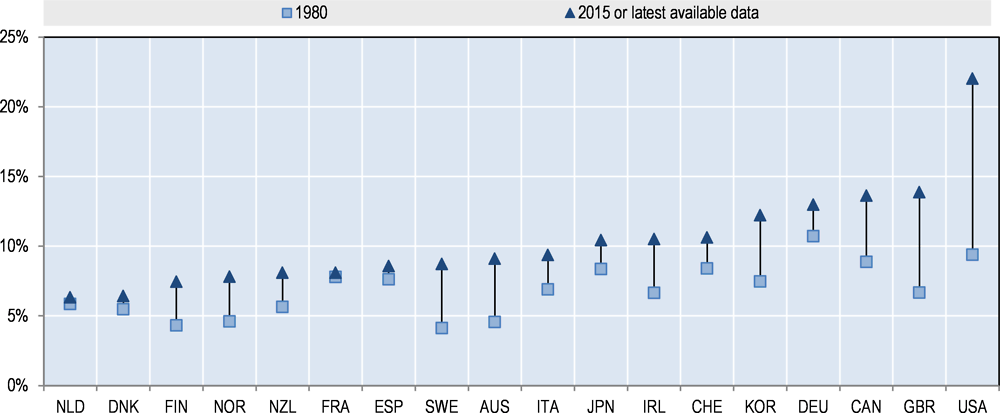
Income inequality has increased in most OECD countries over the past three decades. The Gini coefficient of disposable income inequality stood at 0.29 on average across OECD countries in the mid-1980s. By 2013, it had increased by about 10% or 3 points to 0.32 (OECD, 2015). The latest available data shows that inequality has risen since the mid-1980s in 19 of the 22 OECD countries for which long-time series are available (Figure 2.1).
Nevertheless, trends in income inequality have varied across OECD countries. Inequality first started to rise in the late 1970s and early 1980s in some countries, notably English-speaking countries including the United Kingdom and the United States, as well as in Israel. From the late 1980s, the trend towards increasing disposable income inequality became more widespread, with widening income gaps not only in countries experiencing high levels of inequality but also in countries that were traditionally more equal such as Germany, Denmark and Sweden, where inequality rose faster than in any other OECD country in the 2000s (OECD, 2011). On the other hand, income inequality levels saw very little change in Belgium, France, Greece, Hungary and Mexico, and Turkey experienced a fall in inequality, which is consistent with trends in other emerging countries where inequality is very high but generally declining.

Source: OECD Income Distribution Database
In most OECD countries, the gap between the extremes of the income distribution has also reached its highest level since the early 1980s. In addition to increases in Gini coefficients which are more sensitive to changes in income shares in the middle than in the tails of the income distribution, inequality at the extremes of the income distribution has risen. The richest 10% of the population in the OECD now earn 9.5 times the income of the poorest 10%, compared to a ratio of 7:1 in the 1980s (Cingano, 2014).
The share of the top 1% of incomes in total income has also increased in most countries. According to the data shown in Figure 2.2, the rise was most remarkable in the United States. Top earners in other English-speaking countries also experienced a significant increase in their share of total income and the income shares of the top 1% increased by 70% and now reach about 7-8% in Finland, Norway and Sweden, which have traditionally been characterised by a more equal income distribution (Förster et al., 2014). By contrast, top earners’ income shares grew much less in some of the continental European countries including France, the Netherlands and Spain.
However, some caution is necessary when considering measures of income inequality – with potential for both under- and over-estimation of levels and trends in income inequality. For example, some studies have suggested that commonly used data sources – including those cited above – underestimate the levels of income inequality by not accounting for tax evasion and avoidance, and by not valuing wealth held inside businesses (Piketty and Saez, 2006). Some studies suggest that tax evasion is higher for high income and high net wealth households than for lower income and net wealth households, meaning that a larger percentage of total income and wealth go unreported at the top of the income and net wealth distribution than at the bottom (Zucman, 2014). This suggests that when concealed wealth and income is taken into account, income and wealth inequality is even greater than the many existing estimates suggest. Finally, the choice of start and end points in such a comparison across time may also influence trends.1
In contrast, several studies, usually focusing on the United States, find lower levels and smaller increases in inequality (Auten and Splinter, 2017; Bricker et al., 2016; Burkhauser, et al., 2012). Looking at the United States, Auten and Splinter (2017) argue that measures based on tax returns are biased by tax bases changes and missing income sources. For instance, the income reported on tax returns has changed over time, in particular as a result of base broadening. Changes in reported income may also be the result of changes in tax incentives2. Besides, tax data misses important sources of income, including government transfer payments and non-taxable employer provided benefits. Finally, measures of long-term inequality may be affected by social changes, in particular declining marriage rates. When they account for these limitations, Auten and Splinter find that the increase in top 1% income shares decreases by two-thirds compared to the unadjusted measures of market income, used for example in Piketty and Saez (2003). Accounting for government transfers reduces the increase even more, by over 80%, and after-tax income results are similar.
Source: World Wealth & Income Database
A distinguishing feature of top earners’ income is the share of capital income in their total income. For the vast majority of individuals, wages are by far the largest component of income. Not surprisingly, however, the weight of wages tends to fall higher up the income ladder while the share of capital gains, capital income and business income increases (Förster et al., 2014). Nevertheless, patterns vary across countries. For instance, the top 0.01% receive about 20% of their income from capital in Canada while this share reaches almost 60% in France (OECD, 2014).
In the middle and at the bottom of the income distribution, on the other hand, there is evidence showing that incomes have either grown at a much lower pace or stagnated in a number of countries. For instance, the pre-tax incomes of middle-class households in the United States, the United Kingdom, and Japan have been found to have declined or stagnated in recent years (IMF, 2015). In the United States, Piketty, Saez and Zucman (2016) estimate that, between 1980 and 2013, average national income per adult grew by 60% in real terms across the economy, while national income per adult for the bottom 90% increased by only 30% and national income per adult for the bottom 50% has stagnated3. Data from the World Wealth and Income Database suggests that trends have varied across countries, however, with some countries, including France shown in the graph below, experiencing relatively stable income shares for the bottom 50% (Figure 2.3).
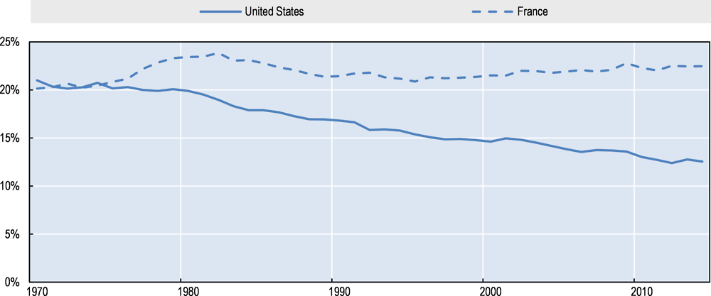
Source: World Wealth & Income Database
Increasing income inequality has been attributed to a range of factors including the globalisation and liberalisation of factor and product markets, skill-biased technological change and increasing firm concentration, which have contributed to a decline in the share of middle-skilled occupations relative to low- and high-skilled occupations and more generally to a decline in the labour share of income, i.e. the share of national income remunerating workers in the form of wages and benefits (Autor et al., 2017; IMF, 2017). Other explanatory factors for greater income inequality include the increasing bargaining power of high earners, changes in labour market institutions and regulations, declining top marginal income tax rates and more generally less progressive tax systems, as well as an increased concentration of assets (see below), which skews the distribution of capital income towards the top.
Wealth is more concentrated than income
Private wealth4 is much more unequally distributed than income. In the 18 OECD countries for which comparable data is available, the bottom 40% own only 3% of total household wealth (Figure 2.4). In comparison, their share of total household income is 20%. At the other end of the spectrum, the top 10% of the wealth distribution hold half of total household wealth and the wealthiest 1% own almost a fifth. The wealth share of the top percentile in the wealth distribution is almost as large as the income share of the top decile in the income distribution (OECD, 2015). As shown in the graph below, wealth inequality is much greater than income inequality in part because many households do not have any (or sometimes even negative) wealth.

Note: OECD18 includes Australia, Austria, Belgium, Canada, Finland, France, Germany, Greece, Italy, Korea, Luxembourg, the Netherlands, Norway, Portugal, the Slovak Republic, Spain, the United Kingdom and the United States.
Source: OECD (2015) based on OECD Wealth Distribution Database and OECD Income Distribution Database
There is a strong but imperfect correlation between the distribution of income and wealth. A new OECD study on the taxation of household savings (OECD, 2018), based on household survey data for European countries, shows that those who earn a high income are also more likely to be wealthy, and those who earn a low income are more likely to have low levels of wealth. However, the correlation is by no means perfect. The association between income and wealth tends to be high at the two extremes of the distribution but much weaker in the middle: households at the bottom of the wealth distribution are more likely to be low-income households and high-wealth households are also usually high-income, while households in the middle of the wealth distribution tend to be more equally distributed along the income distribution (Durand and Murtin, 2015).
Wealth tax declarations
The ideal source to measure wealth concentration would be high-quality wealth tax declarations for the entire population, with extensive and truthful reporting by both domestic and foreign financial institutions. No country in the world has such a perfect data source today. However, the countries that do have net wealth taxes generate useful data on wealth.
Estate and inheritance tax returns
Other tax data can be used to estimate wealth indirectly. A first approach is to use estate and inheritance tax returns to get information about wealth at death. From these sources one can infer how wealth is distributed across the living population, using the method known as the “mortal multiplier, which was invented before World War I by British and French economists.
Individual income tax returns
One can also use individual income tax returns and capitalise the dividends, interest, rents and other forms of capital income declared on such returns (see Saez and Zucman 2013 which uses the capitalisation technique to estimate the distribution of wealth annually in the United States since 1913).
Surveys
Wealth inequality can also be studied using surveys. In the United States, the Survey of Consumer Finances is available on a triennial basis from 1989 to 2013. In the euro area, the Household Finance and Consumption Survey (HFCS) provides harmonised micro-data on euro-area households’ wealth and consumption. The key advantage of surveys is that they include detailed socio-demographic data and wealth questionnaires that allow the measurement of broad sets of assets for the entire population, including tax exempt assets and assets at the bottom of the wealth distribution that are not covered in tax data. Surveys have some important limitations, for instance, they are not available on a long-run basis and they raise serious difficulties regarding the measurement of wealth at the top of the distribution.
Source: Zucman (2016)
While it is very difficult to assess wealth distribution trends over time, some evidence points to increasing wealth inequality in recent decades. Piketty (2014) compiled data from eight OECD countries from the 1970s onwards and concluded that, like income, private wealth has tended to become more unequally distributed in recent decades. Several factors have contributed to this rise, most notably the increase in stock and housing prices relative to consumer prices. Saez and Zucman (2016) find evidence of greater wealth concentration in the United States where they estimate that the share of total household wealth owned by the top 0.1% increased from 7% in the late 1970s to 22% in 2012. Bricker et al. (2016), however, conclude that top wealth shares are lower and growing more slowly. For example, their preferred estimate is that the top 0.1%share increased from about 11% in 1992 to 15% in 2013.5 Based on data from the World Wealth and Income Database, Figure 2.5 compares the evolution of the top 1% net personal wealth share in France, the United Kingdom and the United States, and confirms the trend towards greater wealth inequality in recent decades, in particular in the United States, reversing a long-term decline throughout much of the 20th century.
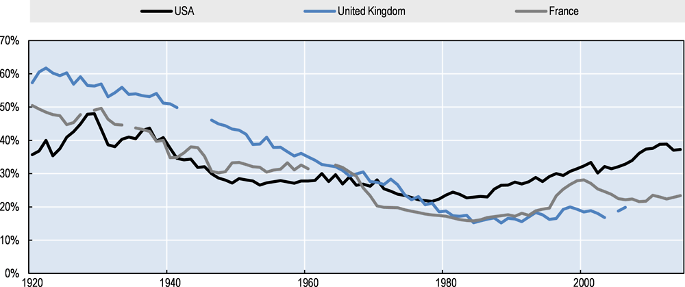
Source: World Wealth & Income Database
There is also some indication that, since the crisis, trends towards greater wealth inequality have continued. Comparable data for six OECD countries (Australia, Canada, Italy, the Netherlands, the United Kingdom and the United States) indicates that, since the crisis, wealth concentration at the top has increased in four of them (Italy, the Netherlands, the United States and the United Kingdom), while wealth inequality at the bottom of the distribution increased in all countries except the United Kingdom (OECD, 2015).
The composition of wealth varies with taxpayers’ levels of wealth
With regard to the composition of assets, overall, households hold the largest share of their wealth in the form of real assets, though this is less pronounced at high wealth levels. Survey data suggests that non-financial assets represent between 70% and 90% of total household wealth in developed countries (IMF, 2014). It is only at the top of the wealth distribution that financial assets start representing a significant source of wealth (OECD, 2015). As shown in Figure 2.6, while non-financial assets are still the largest component of wealth for the fifth quintile, financial assets represent on average about a third of net wealth in the 18 countries for which data is available.
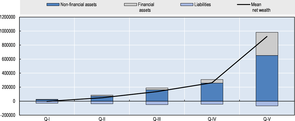
Note: OECD18 includes Australia, Austria, Belgium, Canada, Finland, France, Germany, Greece, Italy, Korea, Luxembourg, the Netherlands, Norway, Portugal, the Slovak Republic, Spain, the United Kingdom and the United States.
Source: OECD (2015) based OECD Wealth Distribution Database
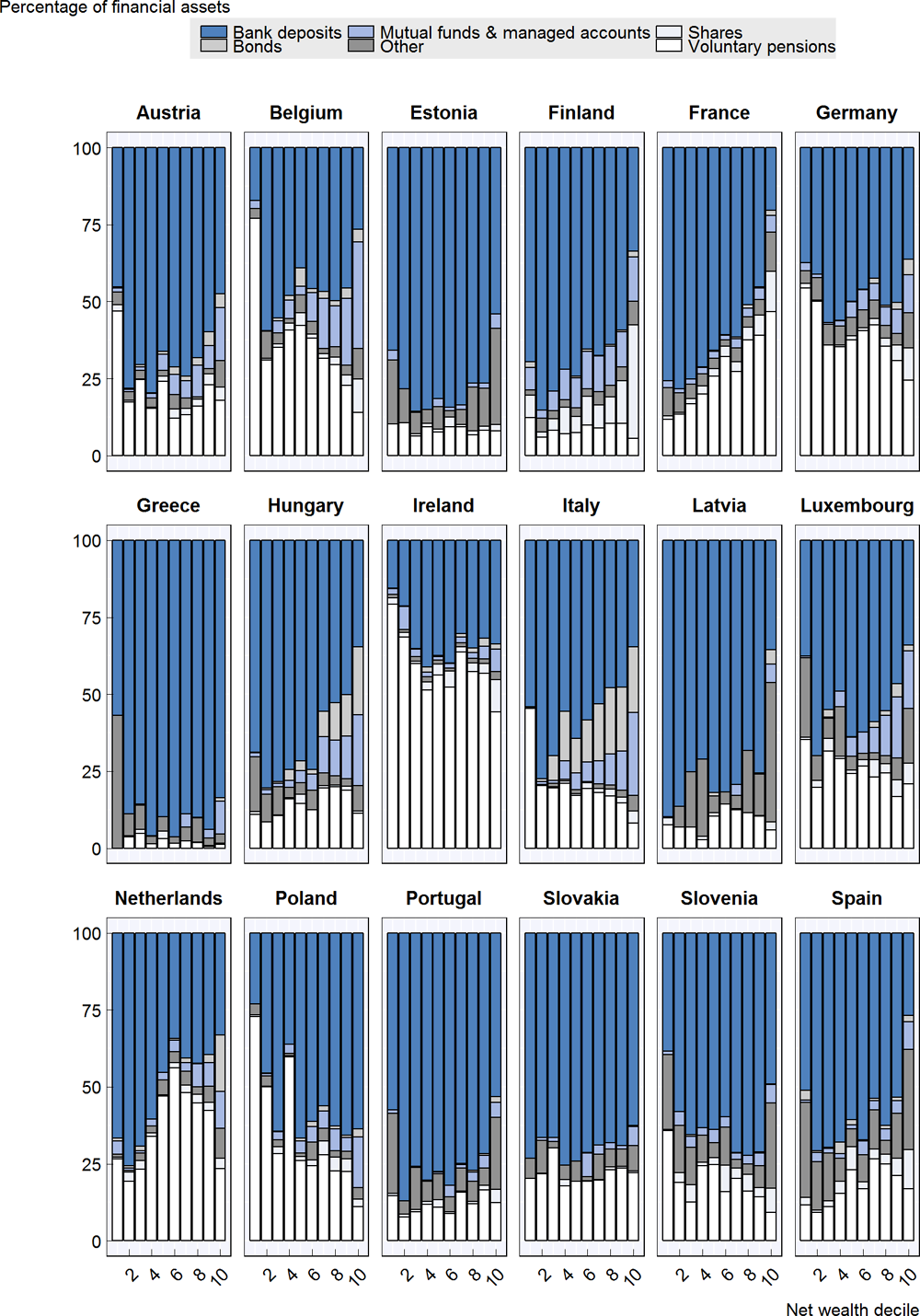
Among real assets (and indeed overall), the main residence is predominant. Figure 2.7 comes from a new OECD study on the taxation of household savings (OECD, 2018) and is based on data from the Eurosystem Household Finance and Consumption Survey (HFCS). It shows that the main residence makes up the largest share of real assets among the middle net wealth deciles and that this pattern is relatively consistent across countries. For lower net wealth deciles, housing forms a slightly lower share of gross assets. Regarding vehicles and valuables, their share varies widely across net wealth deciles, but on average they make up a small share of wealth for top deciles in all countries and substantial shares of those with low levels of wealth. At the top, large shares of real assets are held in the form of second (or third or fourth) residences. Households in top net wealth deciles also have high shares of gross wealth held in the form of self-employed businesses. This reduces the share of total assets held in the main residence, especially in the top wealth decile.

Note: Data are for 2013-14
Source: OECD Taxation o f Household Savings (OECD, 2018) based on Household Finance and Consumption Survey (2017).
With regard to financial assets, their distribution and composition vary across wealth deciles. As mentioned above, financial assets are held mostly by those with higher levels of net wealth. However, they also make up a large share of total wealth for those at the very bottom of the net wealth distribution, mainly because those at the bottom of the net wealth distribution have very low levels of net housing wealth. Caution should be taken in interpreting survey data estimates of asset holdings, however, as they rely on what households declare to statistical agencies. This is particularly true for financial assets for which, in addition to inaccuracies, underreporting behaviours may be common.
Bank deposits are the most common financial assets, although less so at the top of the wealth distribution. Overall, bank deposits account for a substantial share of households’ total financial assets. Figure 2.8 shows variations across net wealth deciles. Bank deposits make up a much smaller share of the asset mix for those at the top of the net wealth distribution. They account for 42.4% of gross financial asset holdings on average for those in the highest net wealth decile. Households in these higher net wealth deciles are more likely to hold financial assets in other forms relative to those in lower net wealth deciles. In contrast, bank deposits comprise 52.4% of gross financial asset holdings on average for households in the lowest net wealth decile. These variations in bank deposits in part reflect different levels of risk aversion, with wealthy individuals allocating a much larger share of their financial portfolios to risky assets (Bach et al., 2015). These savings choices may also be driven in part by varying levels of financial sophistication, with low-income and low-net wealth taxpayers choosing to save in bank deposits because of a lack of financial literacy and knowledge about saving opportunities with higher returns.
Holdings of shares and bonds are concentrated at the top of the net wealth distribution. Households in the top net wealth decile hold 7.4% of all financial assets in the form of shares, while households in the bottom net wealth decile hold only 1.3% on average. Households in the top net wealth decile hold 5.3% of all financial assets in the form of bonds, while households in the bottom net wealth decile hold 0.4%. The average across all net wealth deciles is 1.9%.
In many countries, individuals engage in substantial private pension savings, which is a source of variation in asset holdings across wealth and age levels. Pension savings are a widely used form of saving that usually forms the second largest share of financial assets held in HFCS countries, after bank deposits. Holdings of pension wealth generally decrease along the net wealth distribution as a share of total holdings, though modestly. In the top net wealth decile, households hold on average 16.9% of all financial assets in the form of pension savings, while households in the bottom net wealth decile hold 31.8%. The average across all net wealth deciles is 22.8%.
There is nevertheless substantial variation in the mix of financial assets held across countries. This is particularly the case for pension savings. For instance, Ireland exhibits very high shares of pension wealth (59% of total gross financial wealth on average), but comparatively low shares of wealth held in the form of bank deposits. On the other hand, in Greece, bank deposits account for the vast majority of wealth, including at the top of the wealth distribution, with very little wealth held in the form of pension savings. Estonia and Latvia are also characterised by low levels of wealth held in the form of pension savings. Assets in mutual funds and managed accounts represent relatively significant shares of total assets in top net wealth deciles in Belgium, Finland, Hungary, Italy and Luxembourg.
Overall, many factors account for cross-country differences in the composition of wealth. For instance, the share of financial assets compared to real assets tends to be higher in countries with large private pension systems, high levels of financial development and greater levels of financial education. The share of financial assets may also be higher in countries that have large public housing sectors which tend to discourage home ownership (IMF, 2014). Trends in asset values are also a major factor affecting the composition of wealth. Finally, differences in taxation may influence the composition of household assets.
Note: Data are for 2013-14
Source: OECD Taxation of Household Savings (OECD, 2018) based on Household Finance and Consumption Survey (2017).
Poor households have greater levels of debt relative to their wealth. As a share of gross wealth, those in low net wealth deciles have much higher levels of debt than those in high net wealth deciles. Figure 2.9 shows that the average amount of household debt as a share of gross wealth is much higher in the lowest net wealth decile than for any other decile and that it declines along the net wealth distribution. In nominal terms, and looking at the distribution of household debt across income deciles, however, Figure 2.10 shows that borrowing increases when income increases. Thus, debt deductibility or deductions for interest payments will generally provide greater nominal benefits to those with higher incomes but will also provide higher proportional benefits to those with low levels of net wealth. Figures 2.9 and 2.10 also highlights that most household liabilities are mortgages on the purchase of main residences.

Note: Data are for 2013-14 (see Box 1).
Source: OECD Taxation of Household Savings (OECD, 2018) based on Household Finance and Consumption Survey (2017).

Note: Data are for 2013-14 (see Box 1).
Source: OECD Taxation of Household Savings (OECD, 2018) based on Household Finance and Consumption Survey (2017).
Some evidence shows that increasing indebtedness at the bottom of the wealth distribution has been an important driver of wealth inequality in some countries. In the United States, growing indebtedness has been a major factor behind the erosion of the wealth share of the bottom 90%. For a long time, rising indebtedness was compensated by increases in the values of assets held by the middle class but this trend came to an end with the crisis (Saez and Zucman, 2016). This suggests that correcting wealth inequality cannot only be achieved by curbing wealth accumulation at the top but also requires stimulating the accumulation of wealth at the bottom of the wealth and income distribution.
Wealth holdings generally follow a lifecycle pattern
The net wealth of households varies over time. The within-decile distribution of net wealth is a snapshot in time. As individuals enter the workforce, their income and net wealth are both likely to begin to rise compared to childhood. As individuals retire, their incomes often fall substantially, and their net wealth may decline as they dis-save over their retirement years (though this dis-saving may not apply to households with the highest levels of wealth). These trends may be masked if the income and net wealth distributions are examined without taking age into account.
On average, household net wealth is highest in the years just before retirement. Figure 2.11 shows average and median net wealth across the age distribution. Overall, net wealth is highest amongst those from 50-59 years old, with an average net wealth level of EUR 205 501, and lowest amongst those from 20-29 years old, with an average net wealth level of EUR 68 600. The top three net wealth age groups are ages 50-59 years old, 40-49 years old and 60-69 years old, where the latter two groups have average net wealth levels of EUR 158 082 and EUR 222 938 respectively.
Median wealth across age groups is lower than average wealth across age group, which stems from the relatively high concentration of wealth at the top of the net wealth distribution. However, the stylised patterns across ages are similar to the patterns with respect to average wealth levels across age groups. Overall, net wealth is highest amongst those aged 60-69 years old, with a median net wealth level of EUR 222 128, and lowest amongst those aged 20-29 years old, with an average net wealth level of EUR 47 727.
The extent to which net wealth varies across the lifecycle is different across countries. In Austria and Belgium, for example, net wealth levels vary substantially, peaking at an average of EUR 506 811 and EUR 492 371 amongst those from 50 to 59 and 60 to 69 respectively (though this peak is not as pronounced with respect to median wealth levels). This compares to the lowest 10-year age bracket (ages 20 to 29) who have an average net wealth of EUR 282 329. By contrast, the Slovak Republic has a distribution of net wealth that is relatively flat in absolute terms across various age groups, with the wealthiest age group – those from 50 to 59 – having an average net wealth of EUR 76 772 (and a median level of EUR 61 474) compared to the age group with the lowest average net wealth - those from 20 to 29, who have a net wealth of EUR 22 165 (and a median level of EUR 8 777). This may suggest low levels of aggregate household savings for retirement. These results should be considered with caution, however, given that the estimates of pension wealth in the HFSC are not comprehensive (for more information, see the OECD’s 2018 study on the Taxation of Household Savings).
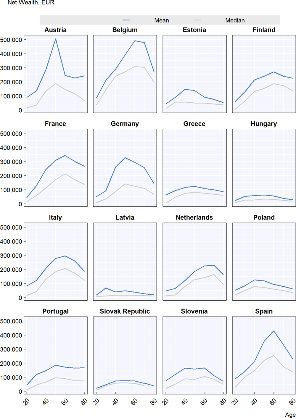
Note: Data are for 2013-14 (see Box 1).
Source: OECD Taxation of Household Savings (OECD, 2018) based on Household Finance and Consumption Survey (2017).
References
Auten, G. and D. Splinter (2017) "Income inequality in the United States: Using tax data to measure long-term trends", US Treasury Department and Joint Committee on Taxation (unpublished paper).
Autor, D., Dorn, D., Katz, L.F., Patterson, C. and J. Van Reenen (2017), “The Fall of the Labor Share and the Rise of Superstar Firms”, NBER Working Paper, No. 23396.
Bach, L, Calvet, L. E. and P. Sodini (2017), “Rich pickings? Risk, return, and skill in the portfolios of the wealthy” CEPR Discussion Paper, No. 11734.
Ball, C. and J. Creedy (2016) "Inequality in New Zealand 1983/84 to 2012/13", New Zealand Economic Papers, Vol. 50, No. 3, pp. 323-342.
Bricker, J., Henriques, A., Krimmel, J. and J. Sabelhaus (2016), “Measuring Income and Wealth at the Top Using Administrative and Survey Data”, Brookings Papers on Economic Activity Spring, pp. 261-312.
Burkhauser, R. V., Feng, S., Jenkins, S. P. and J. Larrimore (2012), “Recent Trends in Top Income Shares in the United States: Reconciling Estimates from March CPS and IRS Tax Return Data”, The Review of Economics and Statistics, Vol. 44, No. 2, pp. 371-388.
Cingano, F. (2014), “Trends in Income Inequality and its Impact on Economic Growth”, OECD Social, Employment and Migration Working Papers, No. 163, OECD Publishing, Paris. https://doi.org/10.1787/1815199X
Durand, M. and F. Murtin (2016), “The Relationship between Income and Wealth Inequality: Evidence from the New OECD Wealth Distribution Database”, paper prepared for the IARIW Sessions at the 2015 World Statistics Conference Sponsored by the International Statistical Institute.
Förster,M., Llena-Nozal, A. and V. Nafilyan (2014), "Trends in Top Incomes and their Taxation in OECD Countries", OECD Social, Employment and Migration Working Papers , No. 159, OECD Publishing, Paris.
IMF (2017), “Chapter 3: Understanding the Downward Trend in Labour Income Shares”, in World Economic Outlook, April 2017: Gaining Momentum?, Washington, D.C.
IMF (2015), “Fiscal Policy and Long-Term Growth”, IMF Policy Paper, Washington, D.C.
IMF (2014), “Fiscal Policy and Income Inequality”, IMF Policy Paper, Washington, D.C.
Kopczuk, W., Martin J., and K. Telle (2016), “Accounting for Business Income in Measuring Top Income Shares: Integrated Accrual Approach Using Individual and Firm Data from Norway”, available at http://www.columbia.edu/~wk2110/papers.html
OECD (2018), Taxation of Household Savings, Tax Policy Studies, OECD Publishing, Paris. https://doi.org/10.1787/19900538
OECD (2015), In It Together: Why Less Inequality Benefits All, OECD Publishing, Paris. https://doi.org/10.1787/9789264235120-en
OECD (2014a), “Focus on Top Incomes and Taxation in OECD Countries: Was the crisis a game changer?”, OECD, Paris.
OECD (2011), Divided We Stand: Why Inequality Keeps Rising, OECD Publishing, Paris. https://doi.org/10.1787/9789264119536-en
Piketty, T. (2014), Capital in the Twenty-First Century, Harvard University Press.
Piketty, T. and E. Saez (2006), “The Evolution of Top Incomes: A Historical and International Perspective”, American Economic Review, Papers and Proceedings , Vol. 96, No. 2, pp. 200-205.
Piketty, T. and E. Saez (2003), “Income Inequality in the United States, 1913-1998,” Quarterly Journal of Economics, Vol. 118, No. 1, pp. 1-39.
Piketty, T., Saez, E. and G. Zucman (2016), “Distributional National Accounts: Methods and Estimates for the United States”, NBER Working Paper, No. 22945.
Saez, E. and G. Zucman (2016), “Wealth Inequality in the United States since 1913: Evidence from Capitalized Income Tax Data”, Quarterly Journal of Economics, Vol. 131, No. 2.
Zucman, G. (2016), “Wealth Inequality”, State of the Union: The Poverty and Inequality Report, Pathways, Special Issue 2016, Stanford Center on Poverty and Inequality.
Notes
← 1. For example, while survey data for New Zealand shows a higher disposable income Gini coefficient in 2013 than in 1984, much of the increase occurred in the late 1980s – such that the Gini is lower in 2013 than in 1993 (Ball and Creedy, 2016).
← 2. For instance, in the 1960s and 1970s in the United States, top PIT rates of 70% gave business owners strong incentives to retain earnings inside corporations rather than paying dividends or higher executive salaries. This reduced measured top income shares because retained earnings do not appear as income on individual returns.
← 3. Other studies, however, do find increases in real incomes for the lower part of the U.S. income distribution. For example, Auten and Splinter (2017) estimate that the average real income of the bottom 90% increased 127% for consistent market income and 172% for pre-tax income from 1979 to 2015.
← 4. It is important to note that the commonly used measures of wealth only include private wealth in the form of real and financial assets. The United States and most other developed countries have public pension systems which provide wealth in the form of the capitalised value of future pensions.
← 5. Bricker et al. (2016) conclude that all of the difference in estimated growth of the top 0.1% share is due to the gross capitalisation rate used for fixed income assets in Saez and Zucman (2016). This capitalisation rate generated the result that fixed income assets (bank accounts and bonds) accounted for nearly half of the total assets of the top 0.1% in 2013 and virtually all of the increase in the top 0.1% share between 2001 and 2013.